Create Your First Project
Start adding your projects to your portfolio. Click on "Manage Projects" to get started
Turquoise Lake
Turquoise Lake Advisory is a management consulting firm dedicated to creating measurable impact through strategic insights and advisory services. Founded in 2013 and headquartered in Bangalore, the firm has built its reputation on guiding organisations with clarity and precision. Several directions were explored and presented to the client, and what I share here is the option that got chosen.
The brand name draws its inspiration from Pangong Lake located deep in the Himalayas at a height of approximately 14,000 feet. Surrounded by mountains millions of years old, this lake is in constant change. Its character changes through the day and night. That is what the brand also believes in – Change being the only constant.
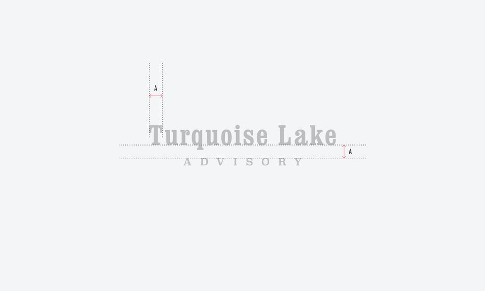
The branding design for Turquoise Lake Advisory reflects a balance of nature and precision, combining mountain peaks and flowing waves to symbolise strength, adaptability, and clarity. Built on geometric principles, the logo achieves timeless harmony and works seamlessly across mediums. The typography pairs a bold serif for “Turquoise Lake” with a refined slab serif for “Advisory,” blending tradition with modernity. A palette of turquoise and deep teal reinforces trust, calmness, and professionalism. Together, the elements create a distinct and versatile identity that communicates authority while remaining approachable.


